

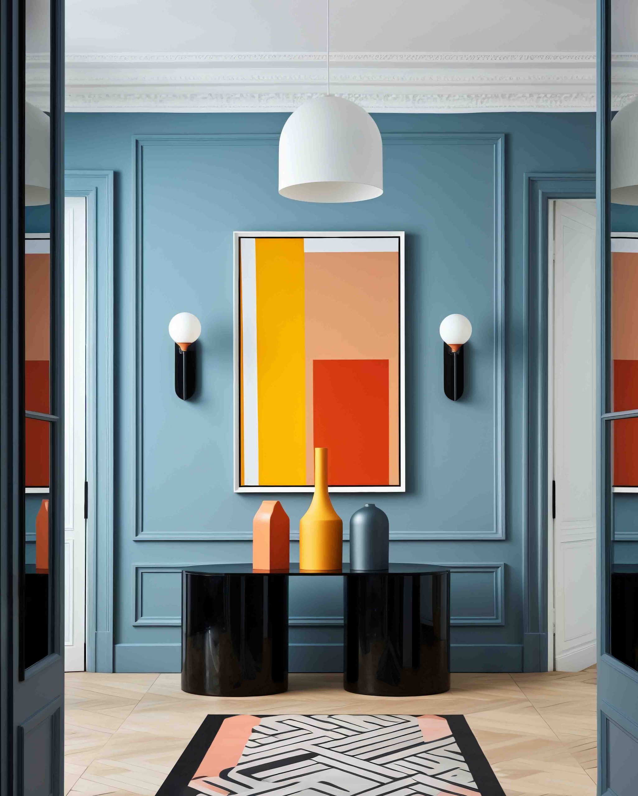
Renovating your home can be exciting, yet overwhelming — especially when it comes to choosing the right colors. Colors surround us, subtly influencing our mood, energy, and well-being in ways we often don’t even realize. From the vibrant tones of a sunset to the calming shades of a peaceful room, color plays a key role in shaping our emotional landscape. Understanding this impact is essential when creating an environment that promotes positivity, creativity, and comfort.
The colors you choose for your walls, furniture, and décor can dramatically transform how a space feels. For anyone considering a home renovation or interior makeover, it’s crucial to select colors that reflect your personality and enhance your living environment. Here’s a practical and inspiring guide to help you through this colorful journey.
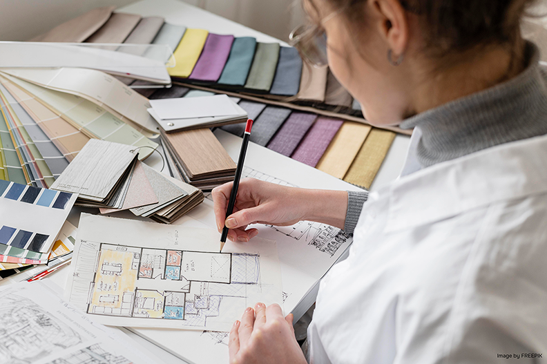
Understanding Color Psychology
Before diving into shades and tones, it’s important to learn the basics of color psychology. Different colors evoke different emotions and can set the mood of a space:
- Warm colors like red, orange, and yellow create energy and a welcoming atmosphere — perfect for kitchens or dining areas.
- Cool colors like blue, green, and purple offer a calming, soothing effect, ideal for bedrooms or relaxation zones.
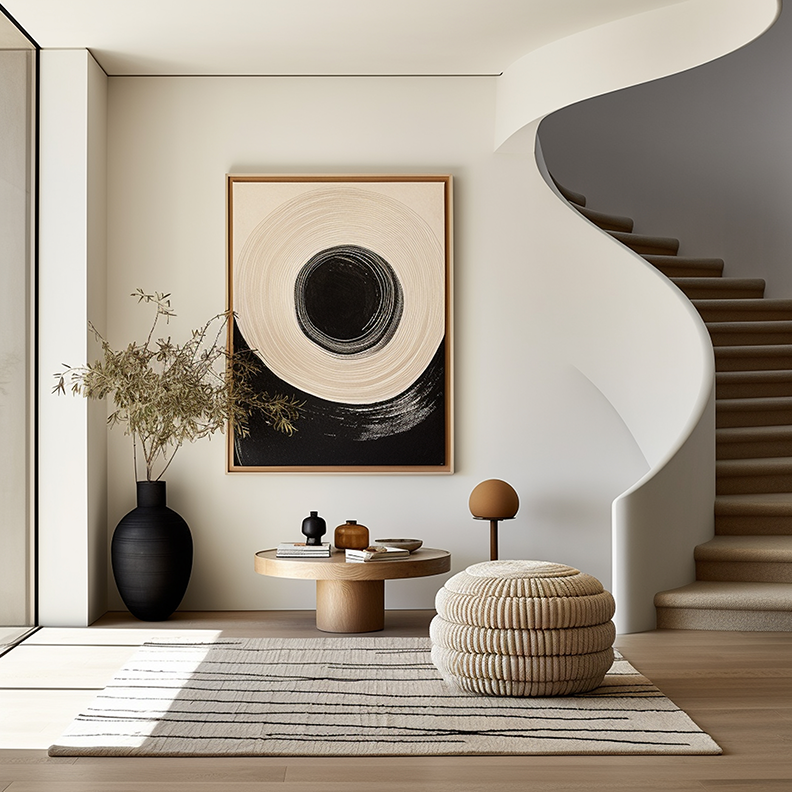
- Neutral colors like white, grey, and beige provide a versatile backdrop that enhances a sense of tranquility and allows vibrant accents to shine.
The Emotional Impact of Specific Colors
- Red: Bold, passionate, and energizing — great for social spaces like living rooms, but overuse may feel overwhelming.
- Yellow: Bright, cheerful, and uplifting — ideal for kitchens, dining areas, or creative spaces, but intense shades can become tiring over time.
- Blue: Calming, peaceful, and serene — perfect for bedrooms, bathrooms, or meditation spaces. Light blues enhance tranquility, while darker blues add sophistication.
- Green: Symbolizing nature and balance, green brings harmony and freshness — excellent for any room, especially home offices or study areas.
- Purple: Associated with luxury and creativity — ideal for artistic spaces, but use moderately to avoid creating a heavy atmosphere.
Choosing Colors Based on Space and Lighting
Each room serves a different purpose, and your color palette should complement both its function and natural lighting:
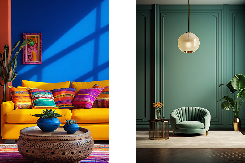
- Living rooms benefit from warm, inviting shades like soft orange or muted yellow.
- Bedrooms feel most relaxing with gentle blues or greens.
- Kitchens can handle bold, appetite-stimulating colors.
- Home offices need calming, focused hues to support productivity.
Natural light drastically affects how colors appear. Well-lit spaces can carry bold, dark tones, while dimly lit areas feel more spacious with lighter shades. Observe how light transforms your space throughout the day before finalizing your color choice.
Creating a Harmonious Color Palette
A well-balanced interior color palette usually includes:
- A dominant color for walls
- Secondary colors for furniture and décor
- Accent colors to add personality and visual interest
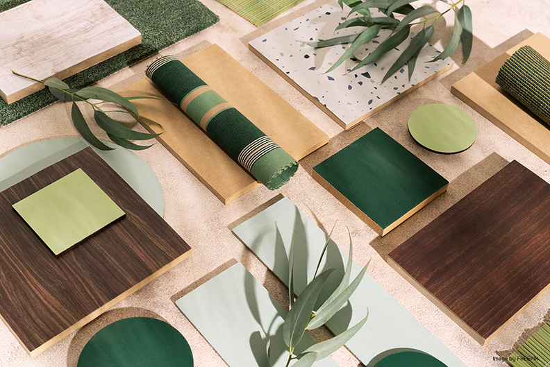
Use online design tools or platforms like Pinterest to explore color combinations and visualize your space.
Test Samples Before Committing
Always test paint samples on your walls and observe them at different times of day. This prevents costly mistakes and ensures your chosen colors work harmoniously in your space.
Follow Trends with Caution — Trust Your Style
While trending shades like sage green or deep navy may be appealing, your home should reflect your unique style and preferences. Trends come and go, but timeless colors that suit your lifestyle and personality will always feel right.
Consider Furniture and Décor
Your existing furniture and key décor elements will influence your color choices. Select hues that complement, rather than clash with, significant pieces like sofas, wardrobes, or artwork. Creating a mood board can help you visualize the entire look cohesively.
Think About Flow Between Spaces
For open-plan homes or connecting rooms, ensure a smooth transition with complementary colors, creating a unified, harmonious feel throughout your interior.
Embrace Color Mixing
Combining bold and neutral tones adds personality and depth. Experiment with different shades to reflect your individuality without overwhelming the space.
Seek Inspiration and Professional Guidance
When in doubt, explore design magazines, blogs, or nature itself for inspiration. And if you’re still unsure, our experienced team at DA Design Studio offers professional color consultation to help you choose the perfect palette for your home.
Colors profoundly influence our mood and environment. With thoughtful choices, your interior can promote well-being, creativity, and personal expression. In a world full of color, let’s harness its power to transform our homes into spaces we love.
If you’re feeling unsure or overwhelmed about selecting the perfect colors for your home, contact DA Design Studio — our experts will guide you through every step of your interior color journey.